Back to work

MASTER'S PROJECT · INTERACTIVE VISUAL DATA ANALYTICS

Similarity Search in Health Data through Interactive Visual Data Analytics

A web application designed to help people with Type 1 diabetes explore their health data, identify comparable situations and better understand patterns through similarity search and interactive visualizations.

CORE IDEA

Explore.
Search.
Compare.

Role

Frontend Development

Team

5 people

Focus

Visual Analytics · HCI · Health Data

Frontend

React · TypeScript · D3

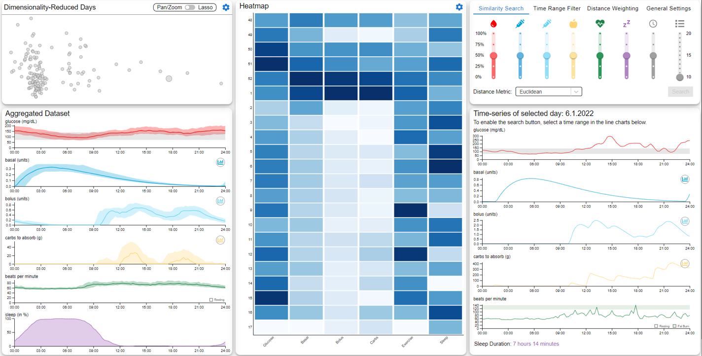
Overview screen of the Type 1 diabetes visual analytics application
01 / CONTEXT

Making complex diabetes data easier to explore.

People with Type 1 diabetes generate large amounts of time-based health data. Glucose levels are influenced by multiple contextual factors such as insulin, carbohydrate intake, physical activity and sleep, making it difficult to understand why similar situations may lead to different outcomes.

Our project explored how interactive visual analytics and similarity search could help users investigate these relationships. Rather than only tracking individual values, the application allows users to search for comparable situations across their data and inspect the factors that contributed to those similarities.
02 / MY ROLE

Frontend development in a five-person team.

The project was developed by a team of five. I worked on the frontend together with one other team member, contributing to the implementation of the user-facing application and its interactive visualizations.

The frontend work was collaborative, so I present it here as a shared contribution rather than attributing individual components exclusively to one person.

03 / PROCESS

From user needs to an interactive prototype.

01

Research

We reviewed existing diabetes-management and visual analytics tools to understand current approaches and identify opportunities for deeper pattern exploration.

02

Understand

Three people with Type 1 diabetes were interviewed to understand their needs, how they explore their data and what similarity means in the context of diabetes management.

03

Prototype

Insights were translated into user tasks and interface concepts. We used Figma and design sessions to explore ways of combining search controls, visualizations and detailed data views.

04

Refine

After feedback on an initial prototype, the interface was redesigned from two separate screens into a more consistent single-screen workflow that adapts after a search.

CONFIGURABLE SEARCH

Users define what “similar” means.

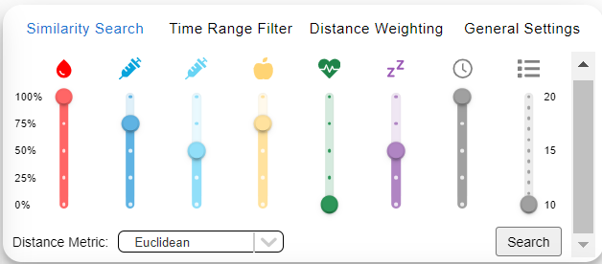
The search can be configured according to the user's priorities. Individual health features can be weighted and different distance metrics can be selected, allowing the search to reflect different interpretations of similarity.

The application supports Euclidean distance, correlation, Dynamic Time Warping and weighted combinations of multiple metrics.

Similarity search settings allowing users to select health features, distance metrics and feature weights.
Similarity search settings with adjustable feature weights and distance metrics.
04 / SOLUTION

Exploration, search and comparison in one interface.

The final application combines multiple linked visualizations. Before a search, users can explore the dataset and inspect individual days. After selecting a query time range, the application searches for comparable situations and reconfigures the interface to present ranked results and comparison views.

01

Explore multidimensional health data

02

Define a query time range

03

Configure similarity criteria

04

Inspect ranked matching situations

05

Compare selected results against the query

06

Understand feature contributions to similarity

AFTER THE SEARCH

Results adapt the entire analytics workspace.

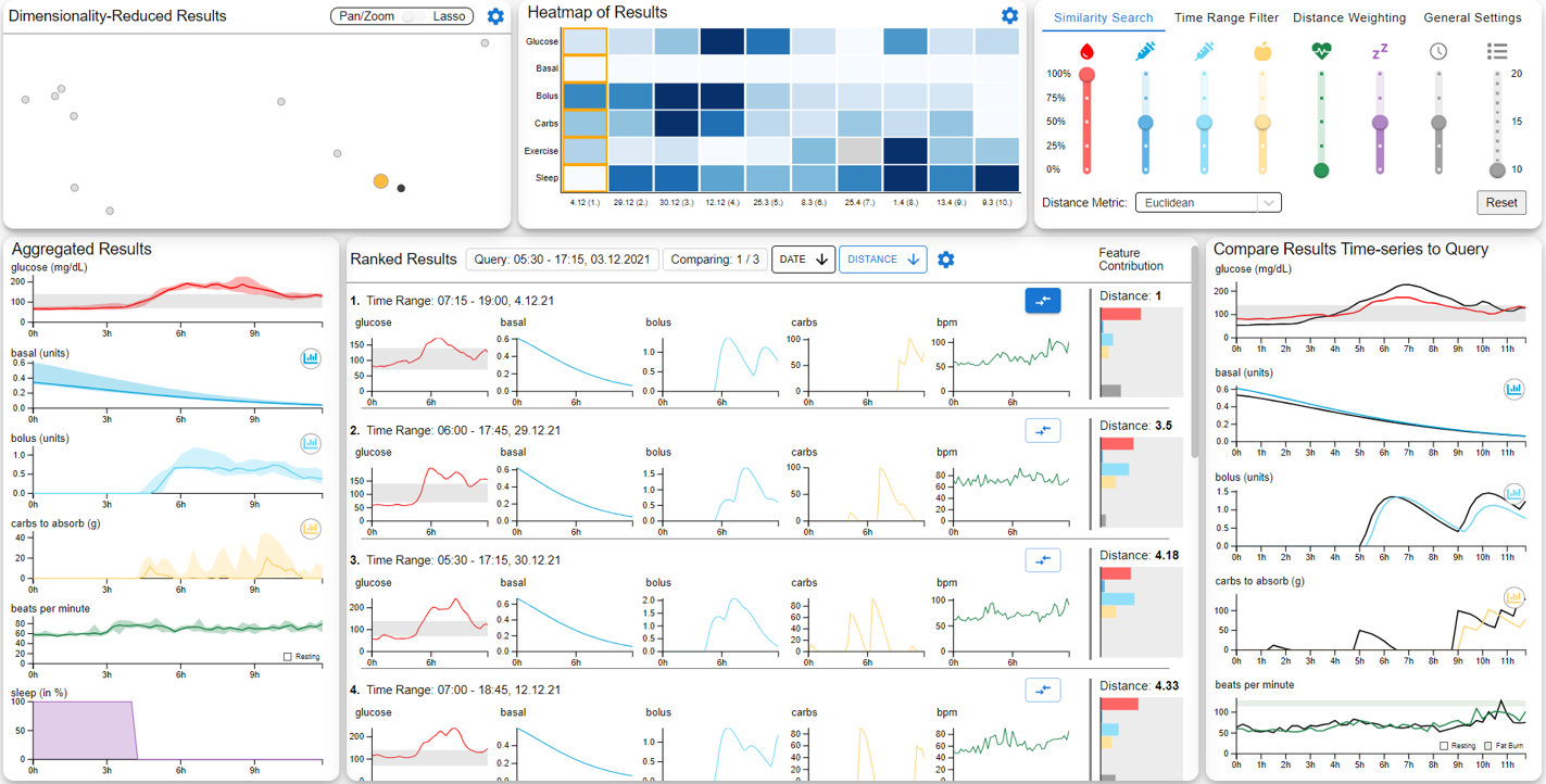
Once the search is executed, the interface makes room for ranked matches while the surrounding visualizations update to represent the search results.

Similarity search results showing ranked matching time periods and visualizations of the selected health data.
Application overview after executing a similarity search.

COMPARISON

From ranked matches to detailed comparison.

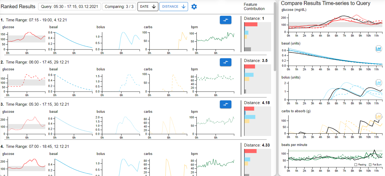
Users can select up to three search results for comparison. Their time-series data is overlaid against the original query, making differences and similarities across individual features easier to inspect.

Comparison view displaying multiple similarity search results side by side for detailed visual analysis.
Three selected similarity-search results compared with the original query.
05 / TECHNOLOGY

Technology stack.

Frontend

React

TypeScript · D3 · Electron Forge

Backend

Python

FastAPI

Data

PostgreSQL

TimescaleDB

Workflow

GitLab

Git · Docker · Figma

06 / OUTCOME

A working prototype and a foundation for further evaluation.

The project resulted in a functional application that combines configurable similarity search with interactive visual analytics. It demonstrates how complex multidimensional health data can be transformed into an explorable workflow rather than presented only as isolated measurements.

A formal user evaluation was planned as the next stage of the project. This would involve people with Type 1 diabetes and visual analytics expertise using the application, thinking aloud while completing tasks and providing feedback for subsequent iterations.

PERSONAL TAKEAWAY

The project gave me practical experience working on a collaborative frontend, developing visualization-rich interfaces and translating a technically complex analytical concept into a user-facing digital product.

BACK TO SELECTED WORK

View projects